
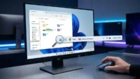
Microsoft’s dance with Windows 11 has been one of polarizing the new age of aesthetics and old school utility. Since its debut in 2021, the operating system has been regularly criticized for stripping away foundational operating system elements across which power users had spent decades learning in pursuit of a simplified interface. However, there have been recent developments indicating a major shift in Redmond’s path, as the company was finally dealing with the technical friction points within the Taskbar and File Explorer. By taking the user’s sentiment over absolute design philosophies, Microsoft is not just fixing a UI, there it is trying to make peace with its loudest population – the professionals and aficionados who see the PC as a device rather than a consuming one.
Also read:Your Eyes Are Lying To You And This Viral Web Game Proves It
The highlight of this update cycle is getting granular control back over the Taskbar, which was completely re-written in the move to Windows 10. For years, the inability to ungroup icons or see labels was considered to be a huge regression in multitasking efficiency. From a technical perspective, the original Windows 11 Taskbar was implemented on a newer (and more limited) architectural framework, and had a greater emphasis on maintaining visual consistency than the involved complex logic underlying more traditional features. The returning of these “power user” toggles means that Microsoft has been able to successfully port the functionality that needs to be present into its new shell environment, proving that modern design need not come at the cost of established workflow ergonomicity. This changes in a way that it provides much greater speed for context switching, thereby lessening the cognitive burden from users who hold dozens of active windows open at once.
Also read:Your Raspberry Pi Is Getting The One Upgrade You Have Been Waiting For
Simultaneously, the File Explorer, possibly the most important component of the Windows shell, is getting some much-needed overhaul in terms of performance and reliability. The first versions of the Windows 11 File Explorer were usually criticized for file latency especially when using the XAML-based elements and the recently introduced context menus. Microsoft’s most recent refinements focus on the guts of the code, the way the application handles metadata and indexing of folders. By offloading the overhead for the WinUI 3 components, the system has a snappier feel, almost the same as the legacy Win32 counterparts, while maintaining the modern features that are in place such as tabbed browsing and cloud integration. This optimization is important to enterprise environments where what sometimes can become massive directory structures as well as network-mapped drives will cause traditional UI wrappers to hang or stutter during heavy utilization.
Also read:AYANEO Pocket DS Secretly Taking Screenshots and Using Massive Data? The Truth Revealed
Beyond these specific modules, the larger implication of Microsoft’s response to feedback is the way that Microsoft’s approach to developing software is changing. In the past, the company relied extensively on telemetry – data on how the average user interacts with the system – as justification for feature removal. However, telemetry tends to overlook the “silent pain” of users who are changing their behavior because they get a feature but not due to their own, and not the reason that they don’t need it any longer. By acknowledging the need for tweaking the taskbar and fluidity in the UI, Microsoft is making some nice points and showing a balanced approach to listening to qualitative feedback and quantitative information. This change is crucial with Windows 11 entering its mid-life cycle where stability and refinement become more appealing to the millions of users who are still in the “halo” phase of current Windows 10.
Also read:This Legend of Japanese Horror is Finally Returning to Haunt Your Nightmares
The refinement of the technical becomes also to the system tray and clock functionality. The choice to permit the display of seconds in the system tray clock may sound like a relatively insignificant aesthetic, but there is a good deal of careful handling of system interrupts and CPU wake cycles that are involved. Microsoft at one time had removed the feature because it wanted to ensure better battery life on their mobile devices, as updating the clock once every second means that the processor cannot enter its lowest power state. The fact that this is coming back as an optional toggle is indicative of a commitment to user agency so that users with desktop workstations or high-end laptops can focus on precision at the expense of marginal power savings. This level of transparency into designing choices, assists bridge the divide between developer’s want for a usable production and a consumer’s measure of how the technological creation should operate.
Furthermore with the integration of these features through the Windows Insider program, the technical agility of Microsoft through its ‘Moment’ updates is made apparent. Instead of waiting at the annual release of features, the company now uses a modular approach to provide improvements to the shell. This makes it possible to have a more iterative feedback loop, in which developers can fine-tune the interactions between the Taskbar, Start Menu and System Tray in real-time. To the end-user it means a more dynamic operating system, one that evolves according to actual use patterns in the real world, between a locked down mobile-like experience and the open, customisable nature that made (and still makes) the Windows brand for three decades.
Also read:Why Your Windows Task Manager Is Secretly Tricking You Every Day
As the need for hardware becomes the constant impetus for today’s computer users to upgrade to modern silicon, these software refinements make transition to modern silicon feel like an upgrade in capability, rather than a simple change in visual style. Microsoft is finally past the “growing pains” phase of Windows 11 as we head towards a version of the OS that respects the legacy of its predecessors while having a modern foundation. For developers and system administrators, these changes are more than merely changes to the UI, it’s a sign that Microsoft is not afraid to acknowledge when a design direction has the wrong ones, and that Windows will continue to be the first choice for professional productivity. The emphasis on mitigating “UI lag” and reclaiming customized workflow points to the next stage of Windows 11 will also be determined by performance and power of the user not simply a new coat of paint.


