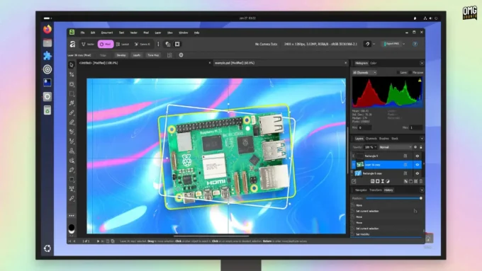
That quiet hum of your devices doing what they should? Home Assistant now listens better. Not so long ago it demanded too much just to turn on a light. Now things flow – menus breathe wider, choices appear where you expect them. For those who skipped setup because wiring diagrams showed up instead of buttons, relief lands today. A fresh look replaces clutter, swaps confusion for calm. Speed jumps when tapping controls, responses snap into place. Even if every gadget at home still works manually, this version meets you there. Complexity fades without losing power underneath. First clicks matter most; they finally feel light. It used to take steps just to test one idea. Today, testing feels like trying, not troubleshooting.
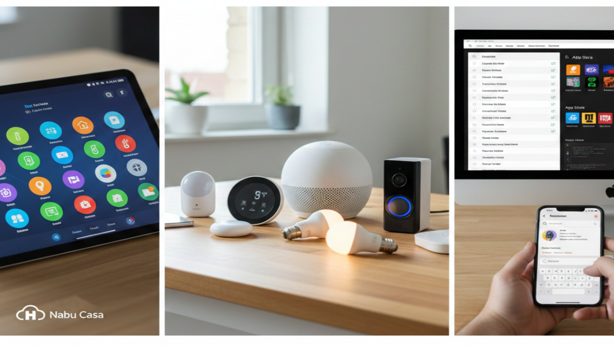
Right off the bat, the fresh default dashboard takes center stage. Long gone are the days when “Lovelace” ruled by default – sure, it had muscle, yet always needed extra tweaks to feel current. Now stepping into the spotlight: the revamped Overview tab, no longer just experimental but fully promoted as the go-to layout. Anyone launching Home Assistant anew lands here first, greeted by a clean face that just works. From the start, its job is clear – show exactly what’s buzzing around your home without delay. Every part – lights, temperature settings, surveillance feeds, music devices – gets its own space, tidy and sharp, zero need to edit YAML files. Old hands clinging to handmade configurations? Fine. The original layout remains an option. Yet after witnessing the smooth finish of this update, returning could feel unnecessary.
Looks matter less now – the 2026.2 upgrade brings a “For You” area that actually jumps ahead. A fresh moving tile shows up by itself when Home Assistant spots something new online. That smart plug you just plugged in? The system speaks before you ask. Little tweaks like this stop it feeling like tech gear, instead it acts like someone who pays attention. What stands out isn’t flashiness, but how quietly it gets things right.
Suddenly, names make more sense around here. Instead of calling them Add-ons, those extra tools now go by Apps – simple switch, big difference. Picture this: Integrations link real gadgets such as smart lights or doorbells to your setup. Meanwhile, separate software bits – think media servers or editing tools – live under the new label, Apps. Confusion fades once the roles split clearly. Behind the scenes, handling these apps feels smoother too. A fresh layout in the control area cuts clutter. Navigation clicks into place quicker than before. Clarity wins without fanfare.
Speed matters more than ever here, plus there’s something fresh hiding in plain sight. This latest update ditches the outdated Quick Bar for a smarter way to get around. Think of it like your phone’s search bar but built right into the system itself. Press Ctrl+K or Cmd+K, depending on your device, then type what you actually need. Pull up lights by name, launch scripts without digging, hop between buried menus – all from one spot. Mobile users gain extra tricks too – swipe patterns now wake the searcher fast. Anyone wrestling with dozens of devices will feel the difference immediately. One tap beats scrolling forever.
One thing standing out in the 2026.2 release? The link to Open Home Foundation’s gadget list. Think of it like a living index, built by users, tracking nearly every smart home tool ever made. Picture searching for a light switch and instantly seeing its communication type, compatibility with Home Assistant, plus whether you can run it without the cloud. Already, more than ten thousand products are logged, spread through two hundred sixty connections. It’s turning into something like a go-to reference guide for connected homes. Now, if you want, your system can pitch in. Flip on device reporting in preferences, then at intervals, harmless general details about your gear get sent over. This shows folks what gadgets get used a lot, yet also highlights those struggling without solid help. Part of a test zone right now, you choose if you join – your data stays private but still feeds into building something bigger for shared control in connected homes.
Inside, this upgrade quietly adds many small improvements that speed up every part of the interface. Slides between screens now flow better, while behind the scenes things hold together more reliably with heavy loads. The direction for 2026 stands out plainly – making things easier to use. Home Assistant isn’t only for tinkerers fixing code on Saturday mornings anymore. Slowly, it’s stepping into view as a real match for what Google, Apple, or Amazon offer, but shaped differently.
Right now, your Home Assistant dashboard likely shows an update alert blinking quietly. Always wise – back up first, even though stepping into 2026.2 feels like sliding down a smooth ramp. Hesitated before about giving it a go? This moment bends differently. Getting started takes less effort than ever, yet what you can do with it stretches further. Smarts creep into corners they missed before, control settles deeper without asking more of you.
Disclaimer: The information provided in this article has been collected from publicly available sources on the Internet. Readers are requested to verify this information with available sources.


